Last Updated: 2026-05-27
Brand assets
The BrandMen Studio brand kit.
Logos, colours, typography and usage rules for partners, collaborators and anyone building with the BrandMen Studio identity. Keep it simple, keep it direct, and let the work do the talking.
All assets are for editorial and partner use. Do not redraw, recolour or distort the logo.
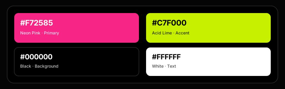
Neon Pink
#F72585
Acid Lime
#C7F000
Black
White
Recommended balance
80 · 15 · 5
01 / Logo
One mark, used consistently.
The wordmark pairs a sharp editorial structure with the BrandMen asterisk. Use the supplied files, keep the proportions intact, and give the mark room to breathe.


Clear space
Keep one asterisk-width of empty space.
Minimum digital size: 32px tall. Never place the mark on a busy photo without a dark scrim.
Scale proportionally
Resize from a corner only. Never stretch the wordmark horizontally or vertically.
Use the supplied files
Download the PNGs here or ask for vector/EPS. Do not trace or rebuild the mark.
Do not recolour
The pink asterisk is part of the identity. For monochrome use, request a single-colour lockup.
02 / Colour
Black and white first. Pink for action. Lime for energy.
The site should feel mostly monochrome, with pink reserved for the moments that matter and lime used as a supporting accent. Neutrals carry the layout; brand colour carries the emphasis.
Primary
Neon Pink
#F72585RGB 247, 37, 133Primary actions, brand moments and active states.
Accent
Acid Lime
#C7F000RGB 199, 240, 0Focus rings, hover highlights and secondary energy.
Base
Black
#000000RGB 0, 0, 0Primary dark surface for the public site.
Base
White
#FFFFFFRGB 255, 255, 255Primary type and icon colour on dark surfaces.
Supporting tints
Use sparinglyPink · deep
#D91A72RGB 217, 26, 114Pressed states and pink text on light surfaces.
Pink · soft
#FF6BAARGB 255, 107, 170Tints, illustration and quiet brand moments.
Lime · deep
#8FAF00RGB 143, 175, 0Lime text and icons on light surfaces.
Lime · soft
#E4FF7ARGB 228, 255, 122Subtle accent fills and hover washes.
Neutrals
StructureNeutral
#0A0A0ARGB 10, 10, 10Cards and raised dark surfaces.
Neutral
#141414RGB 20, 20, 20Secondary dark surfaces.
Neutral
#262626RGB 38, 38, 38Borders and dividers on dark.
Neutral
#E5E7EBRGB 229, 231, 235Borders on light surfaces.
Neutral
#F3F4F6RGB 243, 244, 246Light page background.
Recommended balance
Let the work breathe.
80 / 15 / 5
Pink on black is the strongest brand combination. Lime is a highlight, not a background for long text. Use white type on pink, and black type on lime.
03 / Typography
Instrument Sans does the talking.
A clean grotesk with a wide weight range, paired with the Anek family for Indian scripts. Type should feel direct, confident and uncluttered.
Primary typeface
Instrument Sans
Used for headlines, body copy, buttons and navigation. Tight tracking on display sizes, generous line height for reading.
Aa
400
Aa
500
Aa
600
Aa
700
Type scale
Size / line heightDisplay
56 / 60
Build what matters.
H1
40 / 44
Growth, engineered.
H2
30 / 36
A clear next step.
H3
22 / 28
Designed to convert.
Body
16 / 26
Practical work for ambitious teams.
Caption
12 / 16
Use uppercase and tracking for labels.
Multilingual
Anek family
Indian scripts use the Anek family so the brand stays readable across languages.
Devanagari · Bengali · Gujarati · Gurmukhi · Kannada · Malayalam · Odia · Tamil · Telugu
Monospace
System monospace
Used for code, colour tokens and technical labels.
--brand-pink: #F72585;
--brand-lime: #C7F000;
04 / Usage
Keep it recognisable.
A few rules keep the identity sharp across the site, decks, social posts and partner materials.
Do
- Use the logo on black or very dark surfaces with plenty of clear space.
- Keep the pink asterisk as part of the primary lockup.
- Use white text on pink and black text on lime.
- Let black and white dominate; use brand colour for emphasis.
- Use the supplied PNGs or request vector files for print.
Don't
- Don't stretch, rotate or distort the wordmark.
- Don't place the logo on a busy photo without a dark scrim.
- Don't recolour the mark or swap the asterisk for another icon.
- Don't put white type on lime or pink type on black at small sizes.
- Don't use pink as a full-page background.
Voice
Direct, practical, no fluff.
Say the useful thing first. Short sentences. Concrete outcomes.
Imagery
Real work, real context.
Show the work, the team and the outcome. Avoid generic stock.
Motion
Quick and purposeful.
Short transitions. No decorative motion that slows the next step.
05 / Downloads
Take what you need.
Download the logo files and palette reference. For vector, print, co-branded lockups or a full brand kit, talk to us.
Need vector files or a co-branded lockup?
We will share EPS/SVG files and guidance for print, packaging, events and partner placements.